7 Acrylic Paint Tricks That Will Change How You Build Layers

What You'll Learn From These Layering Techniques
This post covers seven practical approaches to building depth and dimension with acrylic paint. Whether you're struggling with muddy colors, flat compositions, or paint that dries before you finish blending—these methods will give you more control and better results. No fancy supplies required. Just smart techniques that working artists actually use.
Why Do My Acrylic Layers Look Chalky and Lifeless?
The chalky layer problem usually comes down to one thing: too much white in your mixtures. When every layer gets lightened with titanium white to increase opacity, you end up with that washed-out, pastel quality that sucks the energy right out of a painting.
Here's the fix—use transparent pigments to build your underlayers instead. Quinacridone colors, phthalos, and hansa yellows carry intense saturation even when diluted. You get rich, glowing layers that read as luminous rather than dull. Think about how stained glass works—the light passes through transparent layers and bounces back. That's what you're after.
Another culprit? Over-brushing. Acrylic polymer emulsion starts breaking down with excessive manipulation. Five strokes to blend a passage? You're probably overworking it. Three purposeful strokes will almost always look fresher than fifteen tentative ones. Trust the paint to do its job.
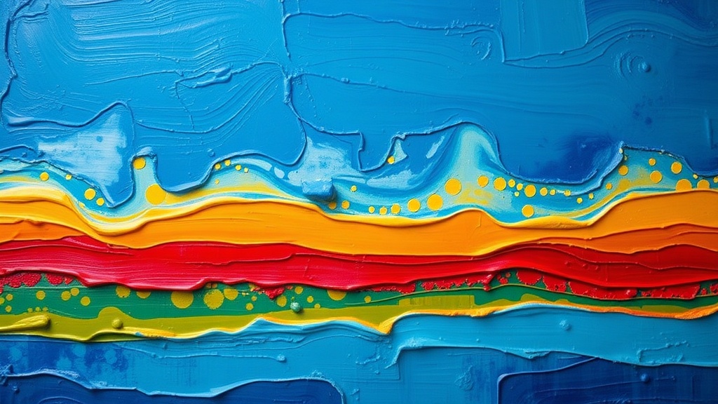
1. The Glazing Sandwich Method
This isn't just throwing transparent paint over dry layers—it's a specific sandwich structure. Start with a transparent stain of color over your white ground. Let it dry completely. Then add opaque passages in the middle values—your lights and darks. Finish with thin glazes that unify and deepen everything.
The magic happens in that middle opaque layer. It gives the eye something solid to land on while the surrounding transparent layers create atmospheric depth. Try this: paint a simple sphere with an opaque middle gray, then glaze warm transparent red on the light side and cool transparent blue on the shadow side. Instant dimensional form without any blending on the canvas.
Materials matter here. A soft synthetic flat—something like a Princeton Velvetouch—gives you smooth glaze application without brush marks. Natural hair brushes tend to drink up your glaze and deposit it unevenly.
2. Wet-Into-Wet Without the Mud
Acrylics have a reputation for drying too fast for wet-into-wet techniques. That's only half true. The real trick is controlling your paint's viscosity and your working environment.
First, grab a fine mist sprayer—not one of those aggressive stream bottles. Lightly mist your palette and the canvas surface before you start. This extends your working time by several minutes. Second, use a slow-drying medium like Golden Open or Atelier Interactive's Unlocking Formula. These aren't cheating—they're just tools that extend the polymer chain's drying time.
Now for the technique itself: work from large to small, thin to thick. Start with big transparent washes. While those are still damp (not soaking), drop in more concentrated color in the focal areas. The paint will feather naturally at the edges—no hard lines, no over-blending. The key is stopping before you think you're done. Let the acrylic do the mingling.
3. The Dry Brush Detour
Everyone learns dry brushing in middle school and then forgets about it. That's a mistake. Used intentionally, dry brush can create texture that reads as weathered, atmospheric, or sun-bleached.
Load a flat brush with thick paint—I'm talking straight from the tube, no water. Drag it across a paper towel until it feels almost too dry. Then skim it across the surface of your painting, letting the raised texture catch the paint. This is brilliant for suggesting wood grain, concrete texture, or that particular quality of light hitting rough plaster.
The technique works best over smooth underlayers. If your surface is already textured, dry brush just highlights every bump and looks messy. Build smooth, then break it up with strategic texture.
How Can I Fix a Layer I Already Messed Up?
Acrylics are forgiving in exactly one way: you can paint over them. But there's a right way and a wrong way to fix mistakes.
The wrong way? Slapping more paint directly over the problem area. That builds up physical texture that catches light differently and screams "correction." Instead, first assess whether you need to knock back the value or shift the hue. For value problems (too dark, too light), use a transparent glaze in the opposite direction. Too dark? Scumble a thin, opaque warm white over it. Too light? Glaze with a transparent dark.
For hue problems—say you painted the sky too green—identify the complement of your mistake color. Green sky needs a red correction. Mix a very thin glaze of the complement and apply it sparingly. The colors will neutralize without building up thick paint.
If you absolutely must cover an area completely, sand it first. Fine grit sandpaper (220 or higher) will rough up the surface just enough for the new layer to grip. Wipe away the dust with a barely-damp cloth and paint away.
4. The Scumble for Atmospheric Depth
Scumbling sounds like a made-up word, but it's just dragging opaque, light-value paint over a darker layer so the dark shows through in broken patches. It's the technique J.M.W. Turner used for his misty atmospheres, and it works just as well with acrylics.
Mix white with a tiny touch of the local color you're scumbling over. If you're scumbling over a blue background, add a speck of blue to your white. This keeps the scumble from reading as flat white—it feels integrated. Use a nearly dry brush and work in circular motions. The result is soft, atmospheric, and completely different from a smooth blend.
This technique excels at pushing backgrounds back. Scumble over distant hills, the edges of shadows, or anything that needs to feel atmospheric rather than sharp.
5. Impasto for Physical Presence
Sometimes you want the paint itself to be the subject. Impasto—thick, textural paint application—catches actual light and casts tiny shadows, giving paintings a sculptural quality that photographs can't capture.
You don't need expensive heavy body paints. Regular acrylics will do fine if you add a molding paste or gel medium. These extend the paint volume without diluting the color. Build up peaks and valleys with a palette knife, then let them dry completely before glazing over them. The transparent color will settle into the crevices and create automatic shadow and depth.
One warning: thick impasto takes days to dry thoroughly. Don't seal your painting or stack it while those layers are still releasing moisture. A week is safe; two weeks is better for very thick applications.
What's the Best Order for Layering Different Opacities?
There's a general rule that works: transparent dark to light, opaque light to dark. Start with your transparent stains and glazes in the shadow areas. Build up opaque lights and mid-tones. Finish with transparent glazes to unify and deepen.
This isn't arbitrary. Transparent darks let the white ground reflect light back through the paint—creating luminosity. Opaque lights sit on top and catch direct light—creating solidity. It's the combination that makes paintings feel alive rather than flat.
There are exceptions, of course. Some artists work exclusively with transparent layers, building form through successive glazes. Others work alla prima, finishing wet-in-wet in a single session. But if you're struggling with muddy, dead-looking paintings, following this sequence will solve 80% of your problems.
6. The Veil Technique for Soft Edges
Hard edges advance; soft edges recede. That's basic visual psychology. But getting those soft edges with fast-drying acrylics requires a specific approach.
Paint your hard-edged shape and let it dry completely. Yes, completely. Then mix a glaze of your background color plus a touch of white. Brush this along the edge of your shape, feathering it outward. The glaze partially obscures the hard edge without eliminating it—you get a visual "veil" that softens the transition.
This is how you paint fog, distant trees, or the soft blur of background figures. The edge is still there; your eye just has to work a little harder to find it. That engagement is what makes paintings interesting to look at over time.
7. Building Skin Tones Without Getting Pink
Portrait painters know this struggle. That flesh tone looked perfect on the palette, but on the canvas it reads as bubblegum pink or jaundice yellow. The problem isn't your mixing—it's your layering.
Human skin isn't opaque. Light enters the surface, bounces around in the blood and tissue, and exits with a warm glow. You can't paint that with opaque paint alone. Instead, start with a transparent underpainting in a neutral earth tone—burnt sienna or raw umber work well. This establishes your shadow structure.
Then scumble your flesh tones over this base. The earth tone shows through in the shadows while the opaque paint covers in the lights. The result reads as skin because it mimics how actual skin interacts with light. Add touches of pure color—a glaze of alizarin in the cheeks, a cool blue in the eye sockets—for the accents that make a portrait feel alive.
Putting It All Together
None of these techniques exist in isolation. A finished painting might use glazing in the background, impasto in the foreground, scumbling for atmosphere, and wet-into-wet in the focal point. The skill is knowing which technique serves which purpose—and having the control to execute each one deliberately.
Start with one technique per painting. If you're new to glazing, do a small study that's nothing but transparent layers. Master the feel of the medium before you try to orchestrate everything at once. Skill comes from repetition, not from knowing more techniques.
And remember: acrylic paint is just polymer and pigment. It doesn't have opinions about how it should be used. The rules here are starting points, not commandments. Break them intentionally once you understand what they do.