Building a Better Color Palette with Found Color Swatches

A painter stands before a canvas, staring at a tray of expensive pigments that, somehow, look muddy and tired. They’ve followed the color theory books to a T, yet the result feels lifeless. The problem isn't their skill; it's that their palette lacks the nuance found in the real world. This post explores how to use found color swatches—physical fragments of color from the world around you—to build more sophisticated, intentional color palettes for your art.
The art world loves to pretend that color selection is a high-minded, intellectual exercise. It isn't. Most of the time, it's just about observation. When you rely solely on a standard set of tubes from a brand like Winsor & Newton, you're working within a pre-defined box. Found color swatches break that box open. They allow you to capture the exact, unpolished hues found in nature or urban environments, giving your work a sense of truth that a digital hex code simply can't replicate.
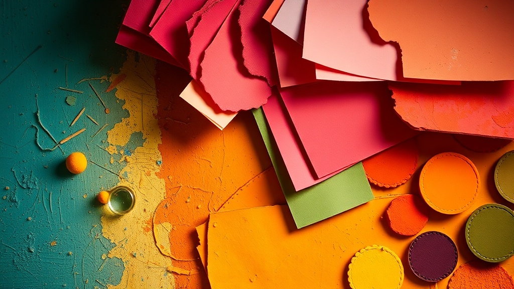
Where Can I Find Interesting Color Swatches?
You can find incredible color swatches in everyday environments like hardware stores, fabric shops, or even the recycling bin.
Don't just look at the sky or a flower. Look at the way a rusted metal gate interacts with a weathered wooden fence. That specific shade of burnt sienna isn't just a color; it's a relationship between two materials.
Go to a local home improvement store. The paint sample cards are a goldmine. They offer highly saturated, specific hues that you won't find in a basic student-grade paint set. If you want something more tactile, head to a textile shop. A scrap of velvet or a piece of patterned linen provides a color that has texture and depth built into it.
Here are a few places to scout for inspiration:
- Hardware Stores: Look for paint chip cards (they're free, usually!).
- Gardening Centers: The packaging for seeds and soil often uses high-contrast, trendy color palettes.
- Grocery Stores: The bright, artificial colors of fruit packaging can provide unexpected neon or pastel-adjacent tones.
- Thrift Stores: Old book covers or vintage upholstery patterns are perfect for studying "aged" color palettes.
I once found a perfect, dusty mauve on the side of a discarded, sun-bleached cardboard box. It was more interesting than any color I could have pulled from a tube of paint. That's the beauty of this method—it forces you to look closer.
How Do I Translate Physical Swatches into Paint?
To translate a physical swatch into a paintable color, you must identify the base pigment and the dominant undertone.
You can't just look at a swatch and say, "That's blue." You have to ask what kind of blue it is. Is it a warm blue leaning toward green? Or a cool blue with a hint of violet? This is where your eyes have to do the heavy lifting.
Once you've identified the hue, you need to find your "anchor" colors. If you're working with oils or acrylics, look at your existing set. If you have a swatch of a specific terracotta, you might need to mix your burnt sienna with a tiny bit of ochre and a dash of white to get that exact desaturated feel.
It helps to use a digital tool for a quick sanity check. You can take a photo of your swatch and use a tool like the color picker functionality in most photo editing software to see the approximate RGB or Hex values. This isn't a replacement for your eyes, but it's a helpful way to see if you're looking at a "warm" or "cool" color.
If you find yourself struggling with color transitions, you might want to check out my previous post on mixing custom gradients. It's a great way to practice moving from one found color to another smoothly.
| Source Type | Best For... | Difficulty to Replicate |
|---|---|---|
| Paint Chips | Flat, solid colors and gradients | Low |
| Fabric Scraps | Understanding texture and light | High |
| Nature (Leaves/Rocks) | Organic, irregular color shifts | Medium |
| Vintage Packaging | Nostalgic or "aged" palettes | Medium |
Why Is My Color Palette Looking Muddy?
Muddy colors usually happen because you're mixing too many complementary colors or using too much black to desaturate a hue.
When you use found swatches, you're often dealing with colors that are naturally desaturated. If you try to replicate a "muted" color by just adding black from a tube, you'll likely end up with a dull, lifeless mess. Instead, try mixing in the complement. If you have a bright green, add a tiny bit of red to tone it down. This keeps the color "alive" even when it's muted.
The problem often lies in the white. If you're using a lot of Titanium White to lighten colors, you might be washing out the vibrancy of your palette. This is a common issue when working with acrylics. If your colors feel "chalky," you might need to look into fixing your dull color palette with better spatial management.
A professional tip: instead of using black to create shadows, use a deep, dark version of your color. If you're painting a blue landscape, use a deep ultramarine or a dark violet for the shadows. This creates much more depth than a flat black.
The goal isn't to be perfect. It's to be observant. A "perfect" color is often a boring one. The most interesting palettes are the ones that feel slightly "off" or unexpected—the ones that mimic the beautiful, messy reality of the world.
Next time you're out, don't just look at the scenery. Look for the colors. Grab a small notebook or even just a phone to snap photos of interesting color combinations. These are your new, custom-made paint sets. They'll make your work feel more grounded, more real, and—most importantly—more yours.
Steps
- 1
Identify Interesting Surfaces
- 2
Capture the Hue with a Sketchbook
- 3
Document the Texture and Light