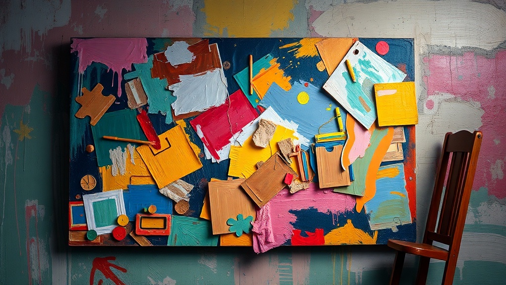
How to Photograph Your Paintings Without Color Distortion or Glare
Why does your beautifully vibrant painting look washed out, yellowed, or strangely distorted every time you photograph it? You spent hours mixing the perfect greens and capturing subtle skin tones—only to have your camera transform them into something unrecognizable. This guide covers the specific techniques galleries and professional artists use to capture accurate images of their artwork, whether you're building an online portfolio, submitting to exhibitions, or creating prints. Getting this right matters because juried shows and online sales depend entirely on how well your digital images represent the real thing. The good news? You don't need a $3,000 camera or a professional studio. You just need to understand how light, angles, and camera settings interact with painted surfaces—and how to correct the problems that inevitably pop up.
Why do my paintings look yellow or blue in photos?
The color cast problem plagues nearly every artist who tries to document their work. Your eyes see the painting one way, but your camera interprets the scene through its own understanding of "white balance"—and that interpretation is rarely accurate under indoor lighting. Incandescent bulbs add an orange-yellow warmth. Fluorescent tubes cast a sickly green. Even "daylight" LED bulbs often carry a subtle blue bias that makes warm paintings look cold and lifeless.
The fix starts with understanding color temperature, measured in Kelvin. Candlelight sits around 1,900K (very warm/orange). Direct sunlight is about 5,500K (neutral). Open shade can hit 7,000K (cool/blue). Your camera's auto white balance tries to guess where it is on this scale, but it often guesses wrong—especially when multiple light sources compete. The solution isn't buying expensive lights (though that helps). It's creating consistency. If you photograph near a window during the day, turn off every indoor light. Mixed lighting creates color nightmares that are nearly impossible to fix later. If you must use artificial light, use two identical bulbs positioned at equal distances from your painting. Most importantly, include a gray card or white balance target in your first shot—this gives you a neutral reference point when editing. Adobe's guide to white balance explains how different light sources affect your images and why manual correction often produces better results than auto settings.
What lighting setup works best for photographing artwork?
You don't need a professional photo studio—you need two lights, two clamps, and an understanding of the 45-degree rule. Position your lights at equal 45-degree angles to the painting's surface, forming a triangle with the camera. This setup minimizes reflections while providing even illumination across the entire canvas. The key is distance: lights placed too close create hot spots (areas that are brighter than the rest), while lights too far away require higher ISO settings that introduce grain and noise.
Daylight-balanced LED panels or 5,000K bulbs work beautifully if you're shooting indoors without good window light. Avoid using your camera's flash at all costs—it creates harsh reflections, washes out textures, and produces that dreaded "snapshot" look that screams amateur. If you're working with natural light, north-facing windows provide the most consistent illumination throughout the day (in the northern hemisphere, anyway—south-facing if you're down under). The quality of light matters as much as the quantity. Hard, direct sunlight creates texture by emphasizing brushstrokes and impasto, but it also creates shadows within the painting itself that distort how the work actually looks. Soft, diffused light—whether from clouds, a white sheet over a window, or softbox attachments on your lamps—reveals the true colors without adding drama that isn't there.
How can I avoid glare and reflections on glossy paintings?
Varied or resin-coated surfaces turn into mirrors under the wrong lighting, reflecting windows, light fixtures, or—you—holding the camera. The 45-degree lighting setup helps enormously, but sometimes it's not enough. If you still see hotspots or reflections, try the "four-point lighting" adjustment: move your lights slightly higher or lower while maintaining those 45-degree angles. Often the reflection is coming from a specific overhead source or window behind you.
Polarizing filters offer another solution. A circular polarizer on your camera lens cuts through reflective glare much like polarized sunglasses cut road glare. You rotate the filter until the reflection disappears—it's almost magical when you see it work. The catch? Polarizers reduce the light reaching your sensor, requiring longer exposures or higher ISO. For smartphone photographers, try the simple "black box" method: position a large black board or fabric behind your camera. The black surface reflects onto the glossy painting, but because it's dark, the reflection is minimal and far less distracting than a window or white wall. Oil paintings with heavy varnish are the most challenging to photograph. If you control the lighting environment completely, try photographing before varnishing—matte paint surfaces have almost no glare issues. If the work is already varnished, you might need to embrace the gloss and photograph at angles that show the texture without the shine. Sometimes a slight side-lighting setup (lights at roughly 30 degrees rather than 45) lets the gloss fall off toward the edges while illuminating the center.
What's the best way to edit artwork photos for color accuracy?
Even with perfect lighting, your raw photos need correction. Cameras capture reality differently than human eyes perceive it, and every device screen displays colors slightly differently. Start with white balance correction using that gray card you shot in the first image. In Lightroom, Photoshop, or even free alternatives like GIMP or Snapseed, use the white balance eyedropper tool on the gray card. This tells the software "this area is neutral gray" and shifts every other color accordingly.
Next, address exposure. Paintings with large white or black areas often fool camera meters into over or under-exposure. Check your histogram—you want the graph distributed across the range without slamming against either edge. For color accuracy specifically, look at the RGB values of known points in your painting. If you remember mixing a particular sky blue, check that area in your photo. Are the red, green, and blue values balanced the way you remember? This is where having the physical painting nearby becomes invaluable. Compare constantly. Adjust saturation carefully—it's tempting to boost vibrancy to match how you remember the painting, but over-saturated photos create disappointed buyers and rejected exhibition entries. The Museum of Modern Art's guide to photographing artwork provides technical specifications that museums use for documentation, which offer excellent benchmarks for saturation and contrast levels. For final color verification, view your edited image on multiple devices—your phone, a tablet, a different computer monitor. If the painting looks consistently accurate across screens, you've nailed it.
How do I resize and export images for different platforms?
Your master file should always remain full-resolution, minimally compressed, and saved in a lossless format like TIFF or PSD. From this master, you create specific versions for specific uses. Juried exhibitions and galleries typically want high-resolution files—often 300 DPI at print dimensions (so a 20x24 inch painting needs 6000x7200 pixels). These files are huge, often 20-50MB, which is fine for email attachments or upload portals but terrible for websites.
For social media and your portfolio website, export at 72 or 96 DPI (screen resolution) at dimensions appropriate for the platform. Instagram prefers 1080 pixels on the short edge. Most portfolio sites work well with 1200-1500 pixels on the long edge. The key is finding the compression sweet spot: small enough to load quickly, large enough to show detail. JPEG quality set to 80-85% usually achieves this balance. Always include metadata—your name, the title, dimensions, medium, and year—embedded in the file. This information travels with the image and helps prevent orphaned works floating around the internet without attribution. The College Art Association's guidelines for image documentation offer detailed specifications for academic and professional contexts that help standardize how artwork is presented across institutions.
Photographing your own work feels technical and tedious when you'd rather be painting. But treating documentation as part of your practice—not an afterthought—means your work gets seen the way you intended. Start with consistent lighting, check your white balance, eliminate reflections, edit carefully against the original, and export purpose-built versions for each platform. Your paintings deserve to be represented accurately, and now they will be.