Mastering the Art of Color Mixing with Primaries

Quick Tip
Always add dark colors to light colors, not the other way around, to save your pigment.
Demystifying the Palette: Why Primaries are Your Best Friend
There is a common misconception in the art world that to create sophisticated hues, you need a massive, expensive set of pre-mixed tubes. In reality, the most profound color depth comes from a deep understanding of the basics. Whether you are working with oils, acrylics, or even exploring natural dyeing techniques, the foundation remains the same: the primary colors.
Mastering color mixing isn't about following a recipe; it is about understanding the relationship between pigment and light. When we strip away the pretension, color theory is simply a logic puzzle that anyone can solve with a bit of practice.
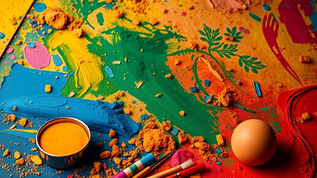
The Core Trio: Red, Yellow, and Blue
The traditional primary triad—Red, Yellow, and Blue—serves as the DNA for almost every shade you see on a canvas. By manipulating these three, you can unlock an infinite spectrum:
- Secondary Colors: Created by mixing two primaries (e.g., Blue + Yellow = Green).
- Tertiary Colors: Created by mixing a primary with a secondary (e.g., Blue + Green = Teal).
- Complementary Colors: These are colors opposite each other on the wheel (like Red and Green). Using them together creates high contrast, but mixing them together creates neutralized, sophisticated grays and browns.
Three Pro-Tips for Better Mixing
To move beyond "flat" colors and achieve the professional depth seen in high-end galleries, keep these strategies in mind:
- Avoid Pure Black: Instead of using black paint to darken a color—which can make it look "muddy"—try mixing a dark blue with a dark brown. This creates a "chromatic black" that feels alive and deep. This technique is a game-changer if you are also experimenting with palette knife texturing, as it adds structural weight to your work.
- Control Your Value: Value is how light or dark a color is. To change value without changing the hue, add white (tinting) or black (shading). However, for a more nuanced approach, try adding a tiny amount of a complementary color to desaturate the intensity.
- The Transparency Test: If you are working with water-based media, remember that color builds through layers. Much like mastering the art of glazing with watercolor, layering thin, transparent washes of primary colors will result in a much more luminous finish than heavy, opaque mixing.
Stop reaching for that specific shade of lavender or forest green in your kit. Start with your primaries, experiment with the ratios, and trust the process. The goal isn't perfection—it's understanding.