Mastering the Art of Color Mixing with Primary Palettes

Quick Tip
Always mix a small amount of your brightest color into a darker base to avoid muddying your hues.
Demystifying the Palette: Why Less is Often More
One of the biggest misconceptions I encounter in the studio is that a "professional" artist needs a massive, expensive set of fifty different pigment tubes to create a masterpiece. In reality, some of the most profound works in contemporary art are achieved through a disciplined, limited palette. When you restrict yourself to the primary colors, you aren't limiting your creativity; you are mastering the very DNA of color.
The goal of working with a primary palette is to understand the relationship between hues. Instead of reaching for a pre-mixed "forest green" or "sunset orange," you learn to build those colors from the ground up. This builds a deeper intuition for color theory and ensures your paintings have a cohesive, harmonious look.
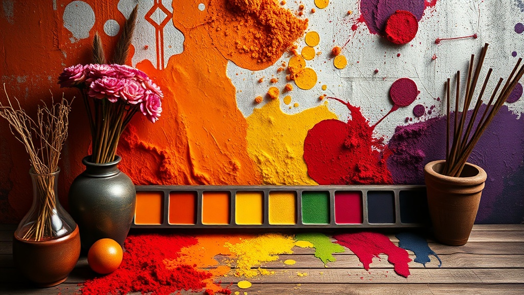
The Foundation: Red, Yellow, and Blue
To truly excel, you must move beyond the basic "crayon" version of primary colors. I recommend experimenting with a split-primary system. This involves having a warm and a cool version of each primary color (for example, a warm red like Cadmium Red and a cool red like Alizarin Crimson). This allows you to mix a much wider spectrum of neutrals and subtle shifts.
As you refine your technique, consider these three actionable steps:
- Test your neutrals: Mix your complementary colors (the colors opposite each other on the wheel) to create sophisticated, "muddy" tones. These are essential for realistic shadows.
- Observe light, not color: When painting a landscape or still life, don't just look for "green." Look for how the light changes the temperature of the color.
- Layer your depth: If you are working with transparent media, remember that color is not just about pigment, but also about light. You can learn more about building depth through mastering the art of glazing to achieve luminous results.
Elevating Your Texture and Tone
Once you have a handle on color, the next step is often adding physical dimension to your work. A well-mixed color looks even more striking when it possesses interesting topography. For instance, if you are working with heavy-body acrylics or oils, you might want to look into palette knife texturing to give your colors a sculptural quality.
"The mastery of color is not found in the abundance of your tubes, but in the precision of your mixtures."
Don't be intimidated by the blank canvas or the simplicity of a few tubes of paint. Whether you are using professional-grade pigments or exploring unexpected household items as art supplies, the principles of color remain the same. Start small, experiment often, and watch your palette come to life.